Graphics/Drawings/3D Design here
December 2014 class: MUL 375 3D Design
08 December 2014: Work in progress
Assignment one of two is for creating a level design for supposed characters to move about in. A room, a hallway or a warehouse with 4 walls, a roof and at least 10 basic models within. The catch, do not light or texture anything. Post it to the class forum and share it... then my classmates will download it and do the lighting and texturing for me with their own interpretation. I will also get to do the same to their works as well. Posts for progress as it occurs. Then we have to repost the results and do lots of commenting. Here is my theme I am aiming for: an automotive garage of sorts. Used Mischief paint program again as it unbeliveably good (as opposed to my terrible spelling). The second design assingment (a mid-term) will be announced shortly.
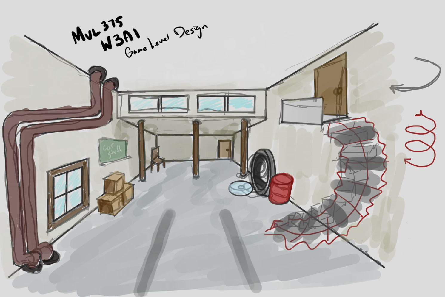
07 December 2014: Class post
Assignment was due at midnight... I tossed the dice idea and went with something more technical looking. I wanted to doodle an idea then make it in Maya. That is exactly what I did.
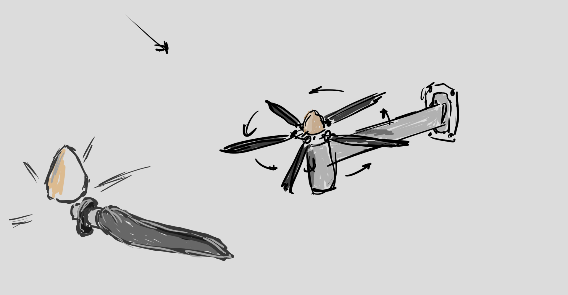
Next to get into creating and rendering. I certainly wish I took more snapshots along the way.
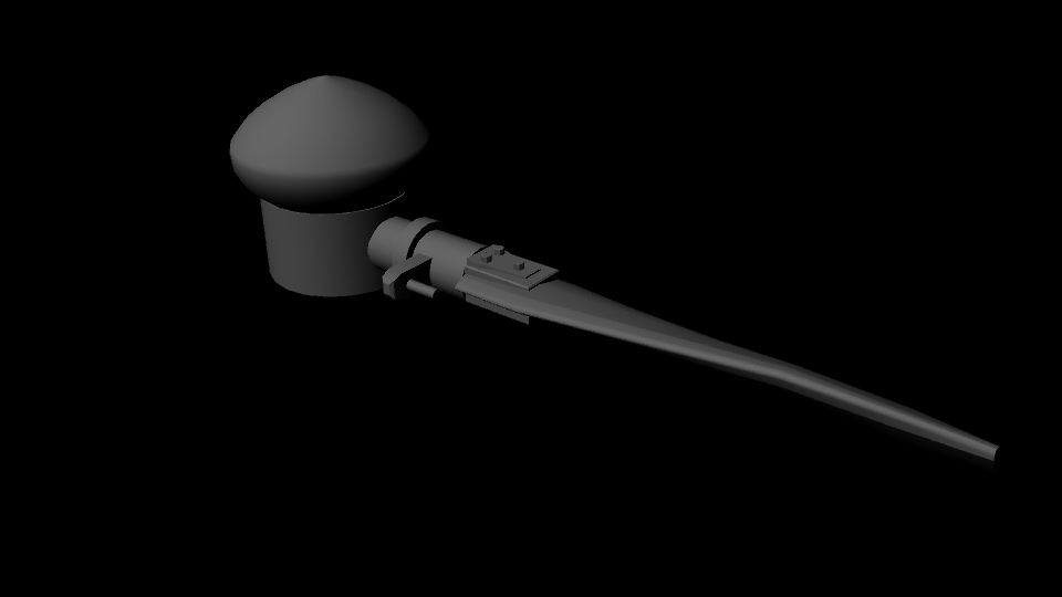
The propeller was taking shape nicely
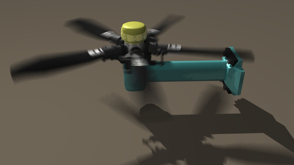
One of the last still renders I made. Next came rotating the blades. I will be posting links to the movie and a gif preview soon.
02 December 2014: Class post
Ok, so from here out I will start pushing the old posts down and put the new stuff on top
Week two is a render of playing dice. I need to model and light them in a scene but most importantly I need to apply a texture map which matches the dimensions of the model. Think the white dots ground into the transparent red plastic... something like that. Maybe I will keep it simple and just make a pair of white dice with black dots... still undecided. Here are two early renders (one opaque and one semi-translucent):

24 November 2014: Class post
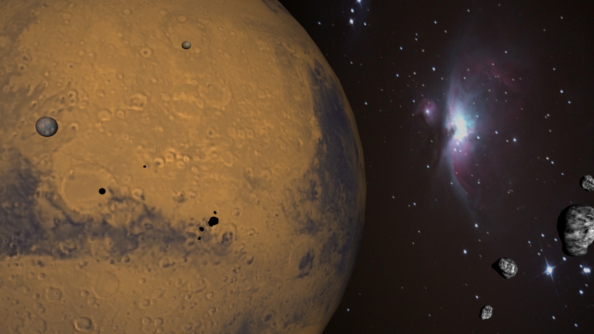
Week one assignment. Mars, both of its moons, implment 'sunlight' somehow, toss in some asteroids and a nebula or other effect. I used my own Orion Nebula shot I took earlier in the week while visiting in Merced, CA. Feel free to open image in a new tab to view at it's full 1920 x 1200 resolution.
November 2014 class: MUL 355 Game Scripting (Flash Action Script)
27 October 2014: Class post
Week One assignment
Here is a fun little tile game from my ActionScript 3.0 book. The author is Gary Rosenzweig but my class required us to swap out the graphics and sounds. After I compiled it to swf file, I am now uploading it to share to friends etc. It is changed to a military theme from the lame elementary theme it started with. Ships and missile are much more cool than books and apples.
NOTE: there is an issue playing this on a MAC... I will recompile with an older flash version maybe...
Next came Week Two's assignment. Also another Gary Rosenzweig authored game but this time I wanted to be more extreme in my change-out of graphics. The class is for game scripting but is in effort to ultimately earn a Bachelors in Digital Media. In this case the emphasis is less own programming and more making effective graphics for flash based games.
This was originally an artillery game and I swapped everything out to be a DDG shooting passing ships. Of course ships cannot just go shooting whoever, but it is just a game. I wanted to use missiles but missiles that fly straight is just not accurate. The 5" Gun works better after brief testing anyway. It is below, enjoy.
NOTE: there is an issue playing this on a MAC... I will recompile with an older flash version maybe...
Now enter Week Three for the class. I veered off the military theme as it became a little overbearing. This is especially true seeing how our projects would be critiqued by fellow students and not just the professor. I don't want to appear fanatical or something. Those projects just seemed to fit the requirements.
Regardless, the new theme was about the show American Pickers. I needed to make an intro movie that fit my desired theme. I drew up a quicky story board of my intent. Then I picked up my handy Wacom Intuos tablet and started the initial animated version. I thought it would be a quick thing to do but I did not comprehend how long it can take to animate something. Much learning still to do.
Initial Scribble
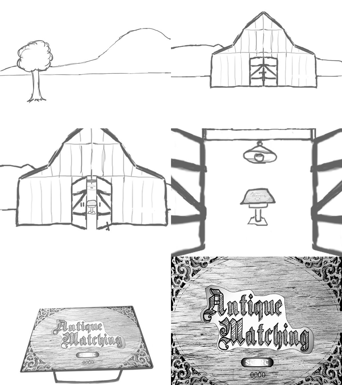
Here is the first version, some six or so hours of frame-by-frame scribbling. Sure, I did do some layer duplication, moving, zooming and such. I should have purely just doodled each layer and it would have been faster... but later the efforts helped me keep more precision for when I decided to add color. I had to add color eventually but would it have been better to wait until Illustrator or just keep it in Photoshop? This will be determined next week when I transition it from Photoshop to Illustrator or maybe just try to take it straight into Flash.
Color Remake
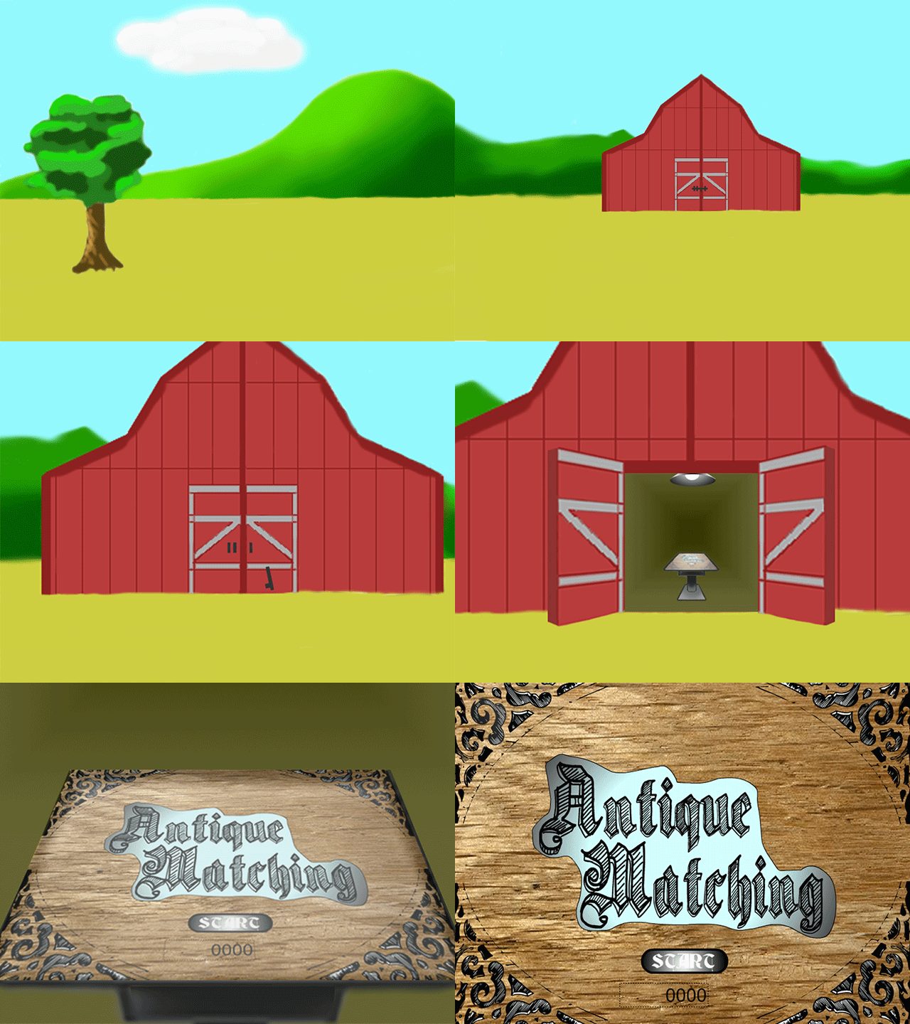
This took MUCH longer. I got all wrapped around the axel for precise lines and where the light was coming from. I didn't like the hills or the clouds. The foreground is horribly plain. The opening doors needed to feel like they were opening and that needed adding more depth to the shapes, changing perspectives, making new layers, fixing colors, straightening lines... I went a little crazy. Twelve or more hours disappeared and before I knew it, most of a Saturday afternoon and all of an evening was spent. True, the frames do not match but there was much learned and I am happy it is done.
Of note, the final assignment broke mid-compile. I will recompile the last working version to post soon.